RES home
The largest unit in RES is a 'fragment' that describes some piece of hieroglyphic text. A fragment basically consists of names of hieroglyphs and indications how they are to be positioned relative to each other. Below we will explain the different elements of the encoding scheme.
The naming of hieroglyphs follows generally established conventions, based on a list of hieroglyphs originally due to Alan Gardiner. There are also larger sets of hieroglyphs composed by others, but these so called 'extended' sign lists are extremely poorly managed and if different versions of these lists assign identical names to identical hieroglyphs then that's purely by accident. Fortunately the basic sign list, as it occurs in the grammar by Gardiner, is generally agreed upon, and many Ancient Egyptian grammar books and dictionaries contain the whole list or parts of it. An unfortunate exception is the grammar by Collier and Manley, who use an aberrant naming scheme for hieroglyphs.
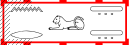
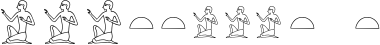
A simple example of a fragment of RES is given below and consists of a sitting man, named 'A1' in the sign list, and a sitting woman, named 'B1'. These are separated by a hyphen '-'. The white space on both sides of the hyphen is optional and has no meaning.
A1 - B1
In the image above, the sitting woman follows the sitting man, consistent with the textual order in the encoding. When the encoding is preceded by '[hrl]' however, which indicates a horizontal right-to-left text direction, then the complete image is mirrored:
[hrl] A1 - B1

Although in most examples below the hyphen means "arrange next to each other", it denotes that hieroglyphs should be arranged beneath each other when the text direction is vertical. There are two kinds of vertical text direction, left-to-right and right-to-left, indicated by '[vlr]' and '[vrl]', respectively, at the beginning of the fragment. For example:
[vlr] D36 - D21 - O41

If you are familiar with the Egyptian writing system, you may know the pronunciations of many hieroglyphs by heart, but looking up the corresponding Gardiner codes remains tedious. For this reason, you may also use the so called mnemonics, as alternative names for hieroglyphs. These mnemonics often correspond to the Egyptological pronunciations of the hieroglyphs. We use the (corrected) list of mnemonics from the Manuel de Codage. In this list, some hieroglyphs have more than one mnemonic, others have none. Using mnemonics, the above can be rewritten to:
[vlr] a - r - O41
Next to the hyphen, there are two other operators, viz. the asterisk '*' and the colon ':'. An asterisk separating two hieroglyphs (or groups of hieroglyphs) means "arrange next to each other", and a colon similarly means "arrange beneath each other". Note that the text direction does not influence the interpretation of '*' and ':', which distinguishes these two operators from '-'. An example is:
N9:t - nTr*nTr*nTr
('t' is a mnemonic for 'X1' and 'nTr' is a mnemonic for 'R8'.)
We may also nest expressions with operators '*' and ':', taking into account that the asterisk binds more strongly than the colon; if we want to have a group composed with ':' to be a subgroup of a group composed with '*', we can use round brackets. Naturally, both ':' and '*' bind more strongly than the hyphen, as was already apparent from the above example. Two examples where ':' and '*' occur together:
r - t:n:W24*Z7 - T14*G41 - N25
(r:a:N6)*G7

If we want to have a hieroglyph appear somewhat differently from its normal appearance, we can attach a list of arguments directly behind its name (Gardiner code or mnemonic) that specifies what needs to be changed. The arguments are separated by commas and the entire list is enclosed in square brackets; the order of arguments within the list is irrelevant. There may be white space within the bracketed lists, but the open bracket must directly follow the name of the hieroglyph. E.g.:
A1-A1[red]-A1[mirror]-A1[rotate=90]-A1[scale=0.4]-A1[shade, red, mirror]
The last hieroglyph above was entirely shaded. We can also specify parts of a hieroglyph that we want to see shaded. This is done by a pattern consisting of one or more occurrences of the four letters 't', 'b', 's' and 'e'. These stand for 'top', 'bottom', 'start' and 'end'. In a left-to-right direction 'start' means 'left' and 'end' means 'right'; in a right-to-left direction 'start' means 'right' and 'end' means 'left'.
Initially, we consider the complete surface covered by the hieroglyph (or strictly speaking, a rectangle that contains the hieroglyph), and for each letter in the pattern we divide the area in two equal parts, until we have processed the entire pattern from left to right. The resulting area is shaded. We can specify several such patterns for one hieroglyph. Patterns for shading are illustrated by the following examples:
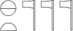
N25[t]-N25[b]-N25[s]-N25[e]-N25[se]-N25[es]-N25[bs,tbe]
Sometimes we want to separate two hieroglyphs by a block of white space of specified width and height. We call such an object an empty glyph. The default dimensions of empty glyphs are 1 EM, unless specified otherwise. (1 EM is roughly the height of a high hieroglyph such as 'A1' and the width of a wide hieroglyph such as 'N37'. E.g. in the following we separate the first two actual hieroglyphs by an empty glyph of 1 EM high and 0.5 EM wide, and the last two actual hieroglyphs are separated by a shaded empty glyph of 2 EM wide.
A1-empty[width=0.5]-B1-empty[width=2,shade]-C1
(Note that e.g. 'A1' and 'empty[width=0.5]', and 'empty[width=0.5]' and 'B1' are themselves separated by the normal amount of white space that separates hieroglyphs, so that, strictly speaking, the distance between 'A1' and 'B1' is somewhat larger than 0.5 EM.)
It is often convenient to make use of empty glyphs 'empty[width=0,height=0]', which are infinitely small. Because this is needed so often, we have introduced a short-hand '.' for such empty glyphs, which we refer to as 'point glyphs'. Typical use is the following, where we influence the positioning of the actual hieroglyphs.
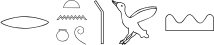
pt:f - .:f - W - pt:.
Since the positioning algorithm inserts extra white space at operators such as ':' when extra space is available, the two occurrences of 'f' are pushed downward, and the two occurrences of 'pt' are pushed upward. If no operators are present, extra space is divided evenly on both sides, as in the case of 'W' above, which is thereby centered within the line.
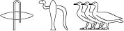
A cartouche is encoded simply by writing the word 'cartouche', and then its contents enclosed in round brackets. For serekhs we instead have the word 'serekh'. Examples are:
cartouche(N5-N28:f)

[vlr] serekh((pr:ib)*s - n)
Note that we may use hyphens in the contents, which are interpreted depending on the text direction as usual.
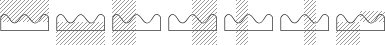
Next to cartouches and serekhs we also have 'inb' (sometimes called 'castle'), 'oval' (like a cartouche but without the bar at the end), and four different types of Hwt. Such objects are called boxes in RES jargon.
Parameters of boxes, if any, are written behind the name of the type of the box, enclosed in square brackets as usual. Such arguments may influence e.g. the size, the color, the shading, and the direction of the box. This direction is by default the same as the global text direction, but occasionally, we need a different direction (an actual example occurs on the Bentresh stela). Furthermore, there are arguments to specify the distance between the contents of the box and the box itself. We illustrate a few of the allowable arguments here:
inb[red,ss,opensep=3](n:r - rw - tA:tA)
As this example shows, shading indicated for a box only applies to the outlines of the box and not to the contents. The argument 'opensep=3' specifies that three times as much white space should separate the left edge of the box from its contents as usual; observe that the space to the left of the 'n' and 'r' is wider than that to the right of the two occurences of 'tA'.
We may stack hieroglyphs on top of each other by the function 'stack'. Its use is illustrated by:
stack(s,r) - stack[under](Hm,D) - stack[on,x=0.76](stack[on,x=0.7](gb,gb),gb)
The argument 'under' means the second hieroglyph (or group of hieroglyphs) is put underneath the first; naturally, 'on' means the converse. The attributes 'x' and 'y', which default to 0.5, can be specified to more accurately determine at which coordinate of the first group the center of the second group is to be located. (The upper left corner corresponds to 'x=0,y=0' and the lower right corner to 'x=1,y=1', assuming the text direction is left-to-right.)
The most distinguishing function of RES is 'insert'. It allows insertion of one hieroglyph (or group of hieroglyphs) inside the bounding box of another, at the specified location. The second hieroglyph is made as large as possible (however, never larger than its natural size), without coming too close to the first. (For more on the distances between hieroglyphs, see below.) A typical example is:
insert[bs](D,d)

This indicates that 'd' is to be put in the bottom-left corner ('s' in '[bs]' stands for 'start', so 'left' in a left-to-right direction), and made as large as possible.
In the following example, 't' is initially placed at the middle of the left edge of '.*w' and then floats up or down in an attempt to make it as large as possible:
insert[s](.*w,t)

By specifying explicit values for attributes 'x' and 'y', which default to 0.5, we may indicate where the second hieroglyph (or group of hieroglyphs) is initially placed before it starts floating in an attempt to maximize its size. In the use of 'insert' below, the software initially places 's' at the default position 'x=0.5,y=0.5' of 'kA', and lets it float in all directions if that helps to increase its size.
insert(kA[scale=1.4],s)

The behaviour of a group of hieroglyphs with regard to the scaling and positioning algorithms can be changed by the function 'modify'. It has several different uses. The first is to pretend that the sizes of the hieroglyphs are smaller than they actually are. This can be useful when we want a hieroglyph to 'stick out' a little:
A1 - modify[below=0.4](E15):modify[below=0.4](E15) - A1Here, '[below=0.4]' means that we divide the surface of the hieroglyph in two parts, the upper is the one that the scaling algorithm becomes aware of (what we call the virtual bounding box), and the lower is that which sticks out and is ignored by the scaling algorithm. The lower part, which is roughly the tail of the dog, is 0.4 times the size of the virtual bounding box.
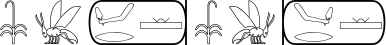
By the argument 'omit', we may furthermore erase the parts that stick out. We may use this, for example, to cut away a slice of a viper:
f - modify[after=1.4,omit](f) -[fix] modify[before=1.4,omit](f)We may also want to erase parts of signs that have become invisible due to damage. If there is nothing left of a cartouche other than its left edge, or when only the bottom part of an occurrence of 'A2' has survived (whereas it could also be e.g. 'A9'), we may write:
modify[after=2,omit](cartouche(.)) ![shade] - empty - . : ![noshade] modify[above=1.5,omit](A2)For the second use of the function 'modify', we may specify values for the attributes 'width' and/or 'height'. This makes the scaling algorithm scale the hieroglyphs within the constraints of the specified values. E.g. the following indicates that we want to make the groups of hieroglyphs exactly 2 EM wide, and to accomplish this goal, either the hieroglyphs may be scaled down or extra white space may be inserted (since we never scale up).
A1*A1*A1 - X1*X1 - modify[width=2](A1*A1*A1) - modify[width=2](X1*X1)
It is often necessary to make a sequence of consecutive hieroglyphs shaded, or to make them red. This is accomplished by what in RES jargon is called a switch; a related term is 'toggle'. A switch is written as an exclamation mark followed by a list of arguments, which is enclosed in square brackets as usual. E.g. '![shade]' switches shading to 'on' and '![noshade]' switches it to 'off'. Similarly, specifying a color (typically 'red' or 'black') in a switch sets the global value for color to that color. E.g.:
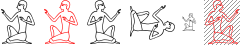
A1 - ![shade] B1 - ![red] C1 - D1[black,noshade] - E1 - ![noshade] F1 - ![black] G1
What is demonstrated by 'D1[black,noshade]' here is that local settings at individual hieroglyphs override global values.
A switch may also set global mirroring to 'on' so that all following hieroglyphs are mirrored. This is known as retrograde text. E.g.:
sw - bit - cartouche(Dsr:r - mDAt) - ![mirror] sw - bit - cartouche(Dsr:r - mDAt)
Switches can be placed virtually anywhere where they could make sense: both before and after operators, and before and after hieroglyphs.
Also the size of the space between hieroglyphs can be influenced. In particular, by assigning a value to attribute 'sep' after an operator, we make the default separation between glyphs smaller or larger by the specified factor. E.g.:
E26 - E26 -[sep=3] E26 -[sep=0.5] E26 -[sep=0] E26
Normally, if there is white space left to fill up the height of a line (or width of a column), this space is divided equally between hieroglyphs, at occurrences of operators. If this is undesirable for a certain operator occurrence, we can specify the argument 'fix', as e.g. in:
n:n:n - n:n:[sep=0]n - n:n:[sep=0,fix]n
The attribute 'sep' can also be used to modify the behaviour of function 'insert', by specifying the minimum distance between the first and the second (groups of) hieroglyphs:
insert[te](zA,ra) - insert[te,sep=0.5](zA,ra) - insert[te,sep=0](zA,ra)
We may change the size of the 'sep' factor globally by a switch; e.g. '![sep=0.8]'. It is reset to the normal factor by '![sep=1]'.
Normally the distance between hieroglyphs is measured in terms of the distance between the bounding boxes, i.e. imaginary rectangles that closely fit around the hieroglyphs. However, often we want instead to measure the distance between hieroglyphs in terms of the distance between pixels, as in the following example, where the distance between pixels from 'x' and pixels from 'G14' is 0.5 times the normal distance between glyphs:
x[scale=0.8] -[fit,sep=0.5] G14

If one is indoctrinated with the MdC, one may believe such fitting is an unnecessary luxury in an encoding scheme for hieroglyphic, but a superficial investigation of original inscriptions quickly reveals that fitting was the rule rather than the exception in Ancient Egypt. For this reason we allow a global value for fitting to be switched to 'on', by a switch '![fit]'. It can be switched to 'off' again by '![nofit]'.
A typographic term related to fitting is 'kerning'. However, kerning between two adjacent characters is commonly given by a fixed distance determined by the font designer. In our case, the process of fitting is done while an expression is rendered, and depends on the physical appearance of glyphs or groups of glyphs.
The following hieroglyphic writing is notoriously difficult to get right. Naively, one would try:
x*x:x - D40

Note that the upper two occurrences of 'x' are made smaller than the bottom-most one. This is because 'x*x' is wider than 1 EM. The scaling algorithm namely works in such a way that it scales down the (groups of) hieroglyphs on both sides of the operator ':' to be no more than 1 EM wide, by default.
In RES however, this size (indicated by attribute 'size') can be freely set to a different value, e.g. to 3 EM, which should be large enough to accommodate for 'x*x', but any larger value will lead to the same result. The argument, in this case 'size=3', should be specified at the first occurrence of ':' if there are several occurrences that belong together. In the example above, there is of course only one occurrence, and we obtain:
x*x:[size=3]x - D40

We could even specify 'size=inf', where 'inf' stands for 'infinity', to indicate we don't want any restriction at all on the width of the groups of hieroglyphs combined with ':'.
But this is still not quite right. Since the amount of white space between the upper and lower groups is determined by the bounding boxes, the lower occurrence of 'x' is further away from the two upper occurrences than the upper occurrences from each other. This is corrected by the use of 'fit':
x*x:[size=inf,fit]x - D40
However, there are two cases where we need to use modern characters inside hieroglyphic. The first is text-critical notation, as the square brackets in the following:
"["[blue] - ![shade] N42:t ![noshade] - "]"[blue] - B1

Such modern characters behave just like normal hieroglyphs, and we can modify them by arguments in the same way, as illustrated above.
Although one could also use other modern characters in this way, it only makes sense for brackets and similar signs, since modern characters are mirrored in the case of a right-to-left text direction, just like ordinary hieroglyphs, and e.g. Roman letters would become illegible.
The second use of modern characters is for footnote markers and short words, such as "tr" and "sic". We refer to these simply as notes. Notes are represented as strings enclosed in double quotes, and preceded by '^'. Examples are:
wr^"b"[blue]:A1 - empty[width=2]^"ca. 2 gr." - cartouche(ra-nTr-kA^"c"[blue])^"sic"
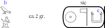
An implementation should place the notes somewhere near to the corresponding hieroglyph (or empty glyph or box).
Naturally, notes are not mirrored in the case of right-to-left text directions.
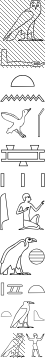
[hrl] ![shade] m:a ![noshade] - t:n -[sep=0.3] T14*G41 - N31:Z2 - A1*i - x[scale=0.8]*[fit,sep=0.5]G14 - t*N23*[sep=0.5]Z1 - q*[fit]A*[fit]t -[fit] A28*m[s]

The same fragment, but now in columns, right-to-left:
[vrl] ![shade] m[scale=0.9]:a ![noshade] - t:n - T14*G41 - N31:Z2 - A1*i - x[scale=0.8]*[fit,sep=0.5]G14 - t*N23*[sep=0.5]Z1 - q[scale=0.7]*[fit,sep=0.8]A*[fit,sep=0.5](.:[sep=0.5]t[scale=0.7]:.) - A28*[sep=0.3]m[s]